Planning: Title Design
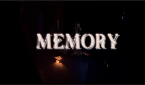
Hey y'all! Today I will discussing my title design with you all. The opening titles of my film will all be the same font. The words will pop up on the screen in different locations and will stay there for about 3-4 seconds each. The words will not be apart of the setting where I am recording since I want them to stand out. The titles will preferably contrast the background of the film. I want the words to be a lighter color like white or a cream color and the background to be black or dark gray. However, not all of the time will the background be darker. For this reason, the words will become like a black or dark gray when the background is lighter.
My current title idea is "Memory" and I will have it appear in at least the size 30. I have decided on one font but there are others that I like as well. I feel like I will not be certain with my font until I start editing and putting everything together. I like the fonts Lacquer, Zighead and Unutterable. I do not know what size I want for these titles either. I would prefer to test them out. In the media attached above, I used the font Zighead and a cream color with a glow on it. I can not wait to start filming! Well, I hope you are enjoying this process too!
Bye, Pookiees!

.jpg)

Comments
Post a Comment